Grammar Sans
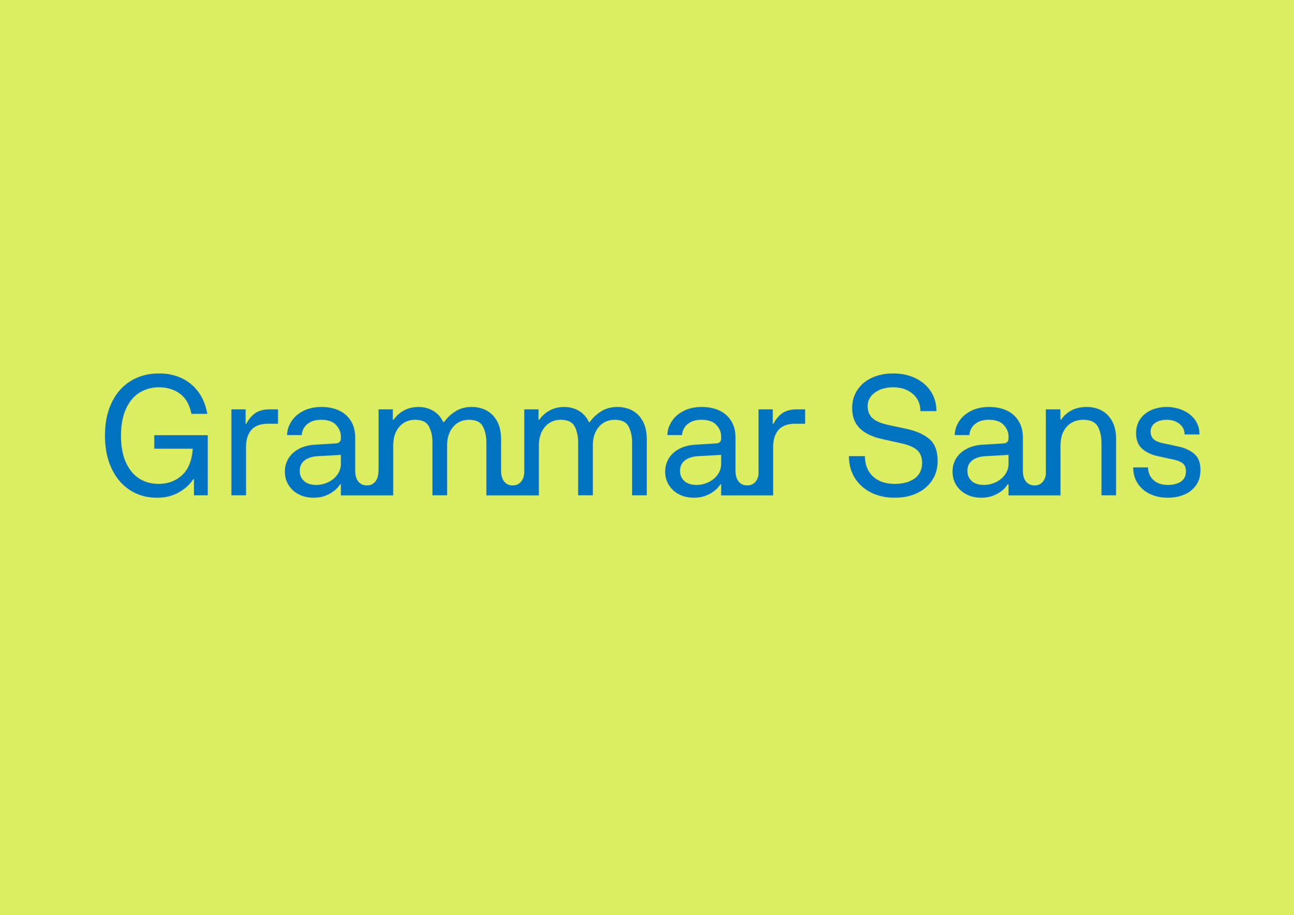
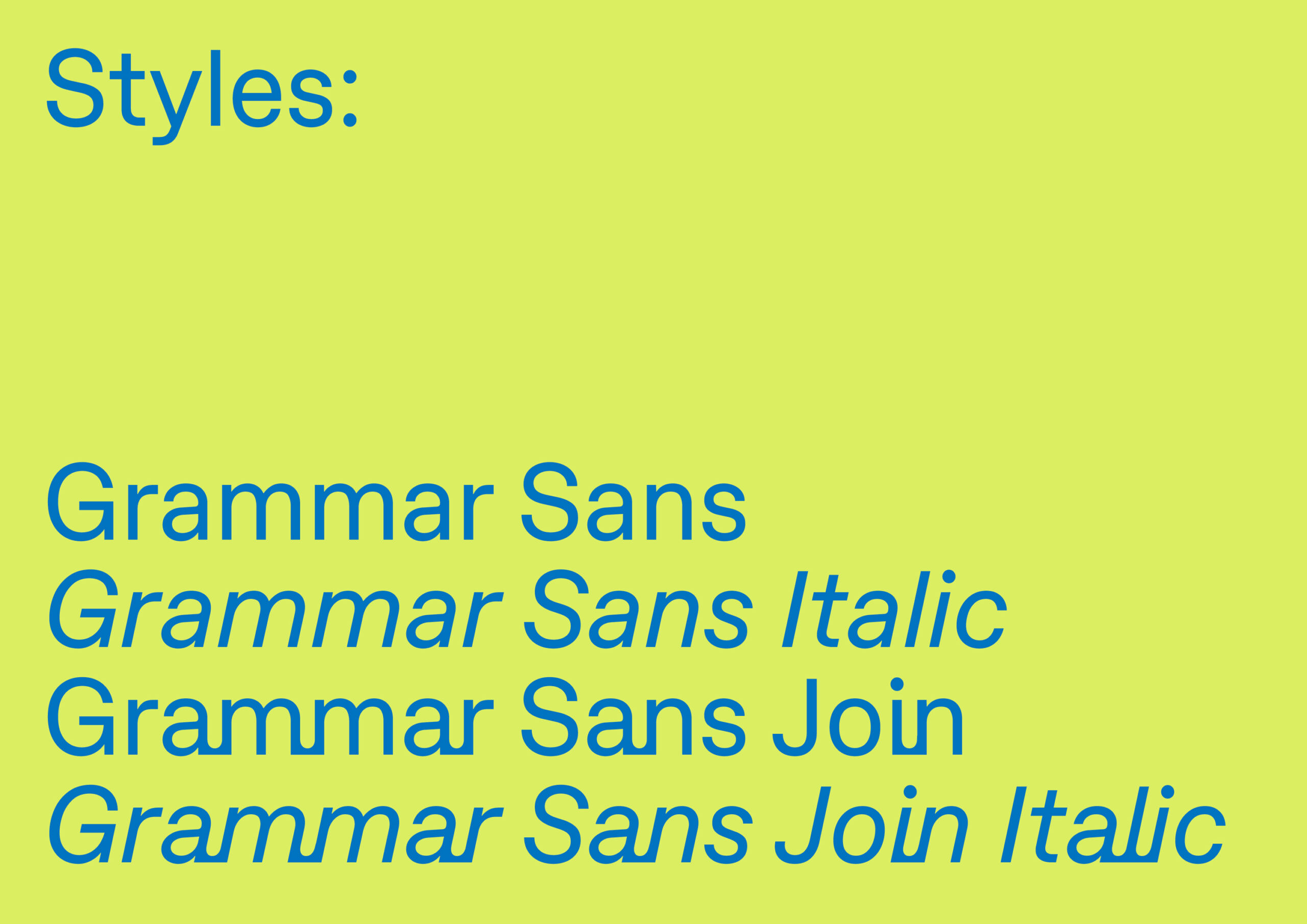
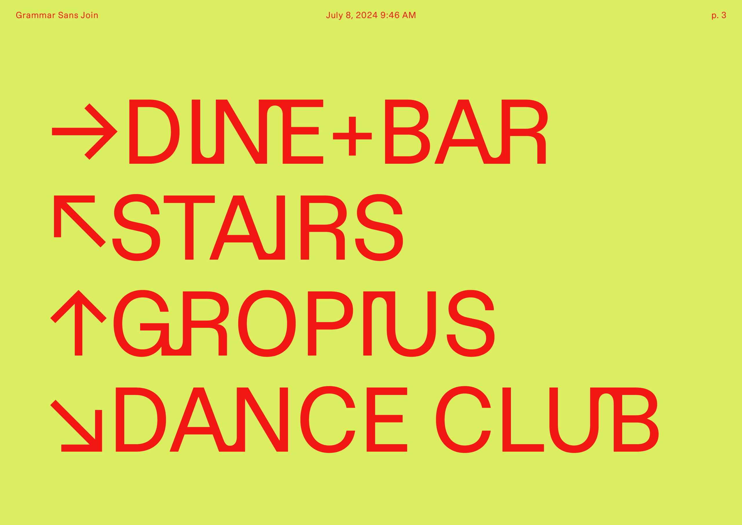
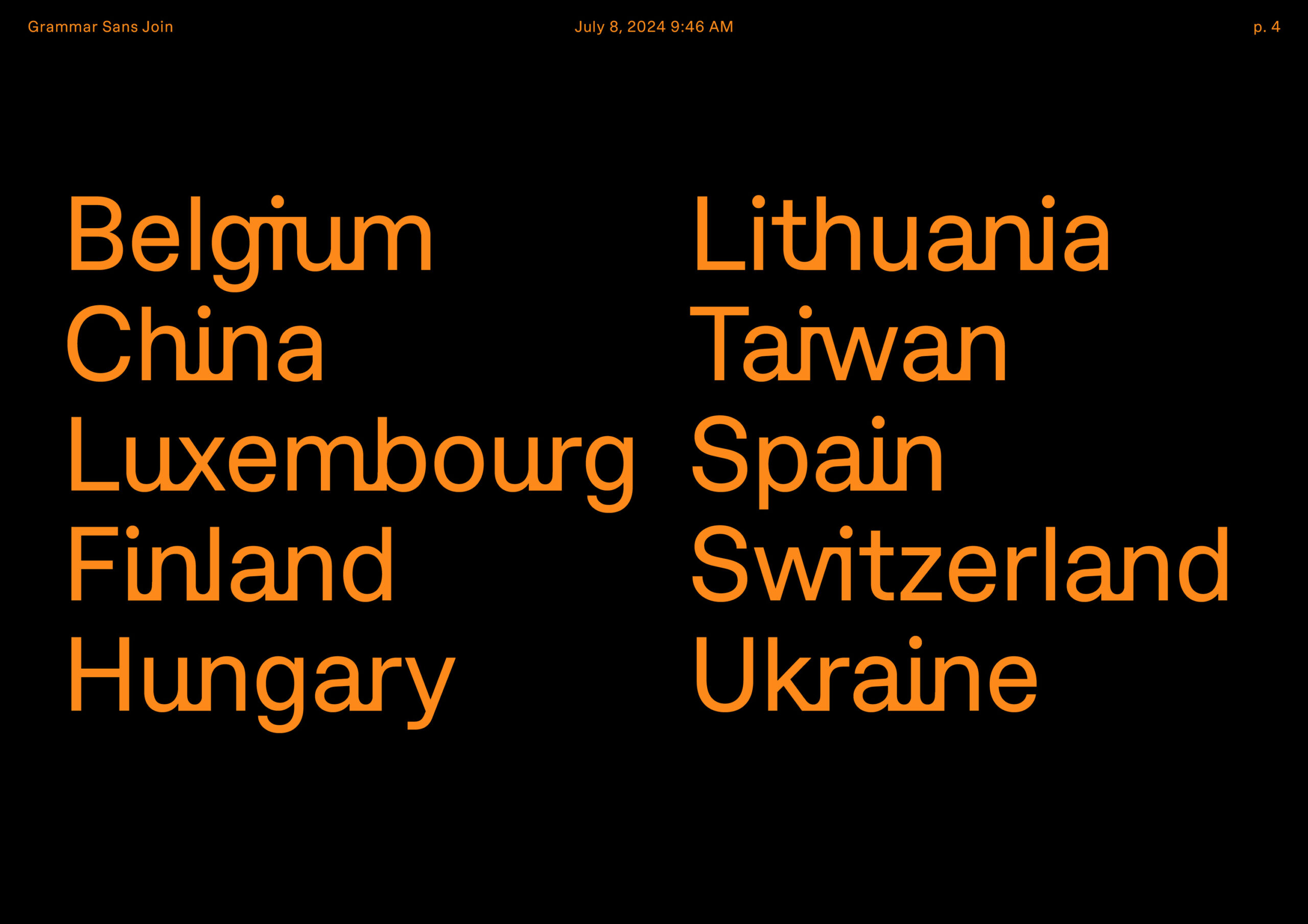
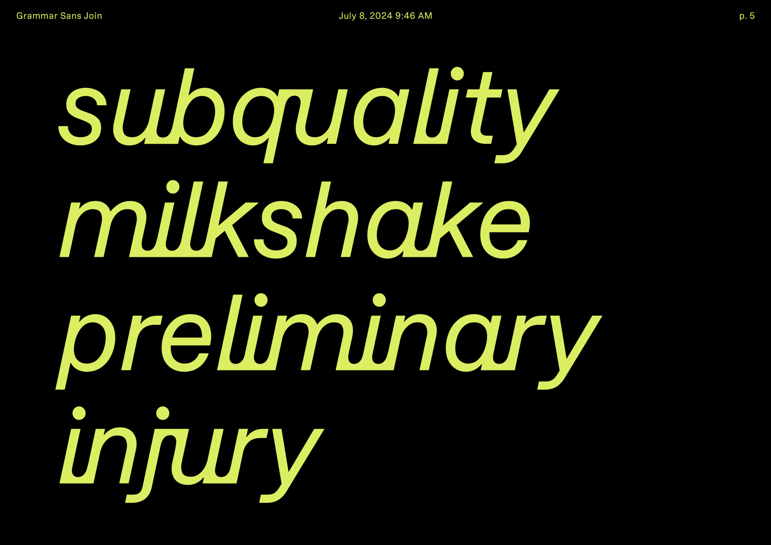
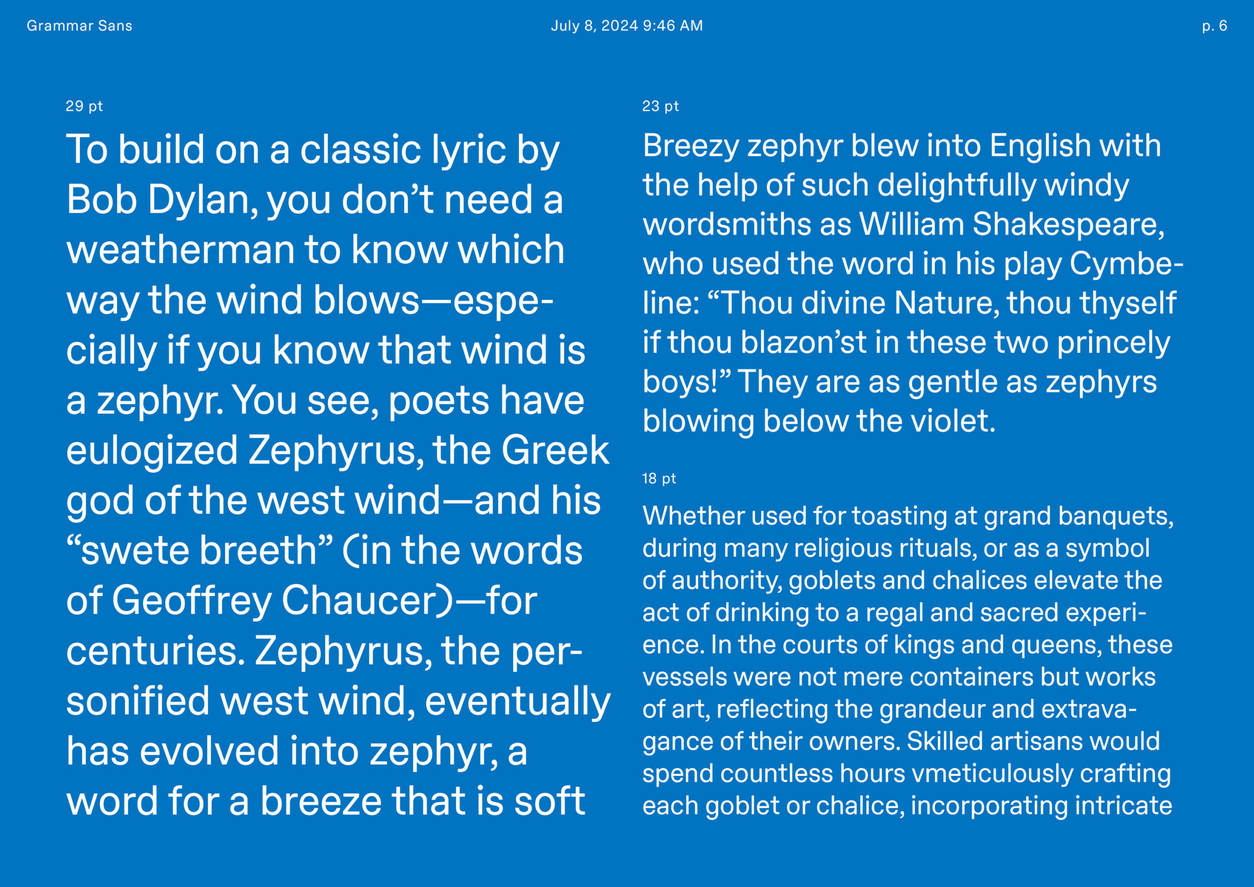
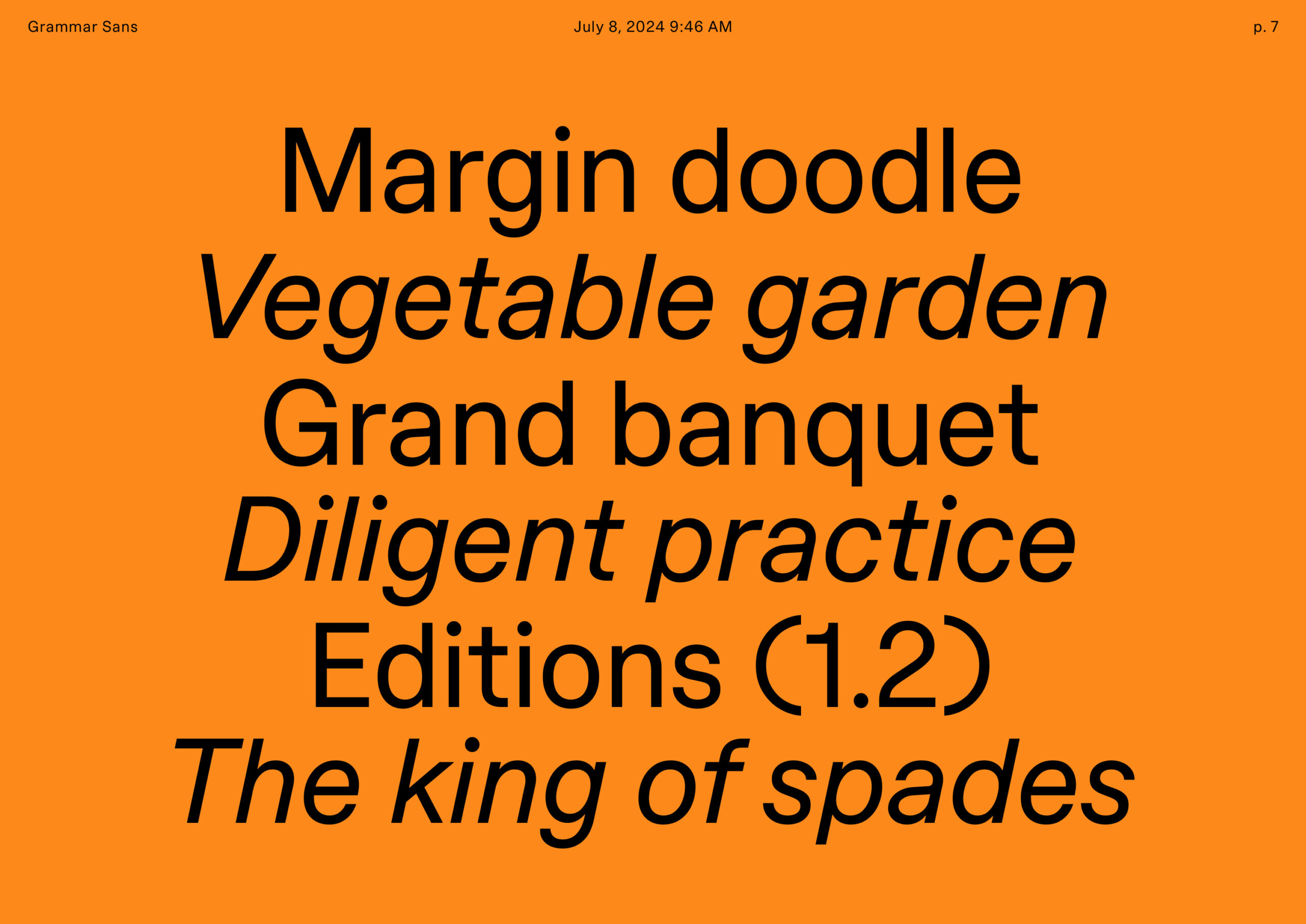
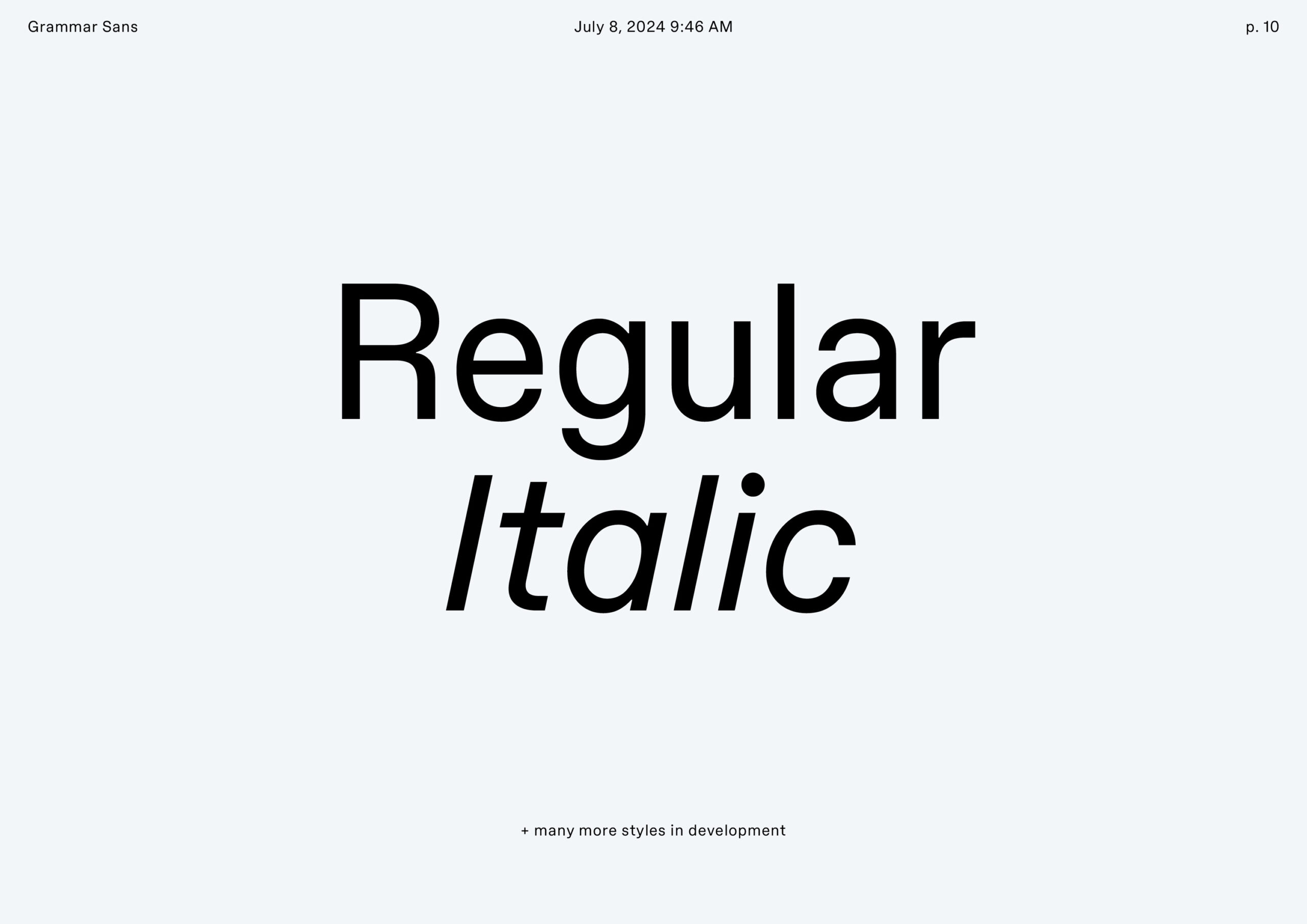
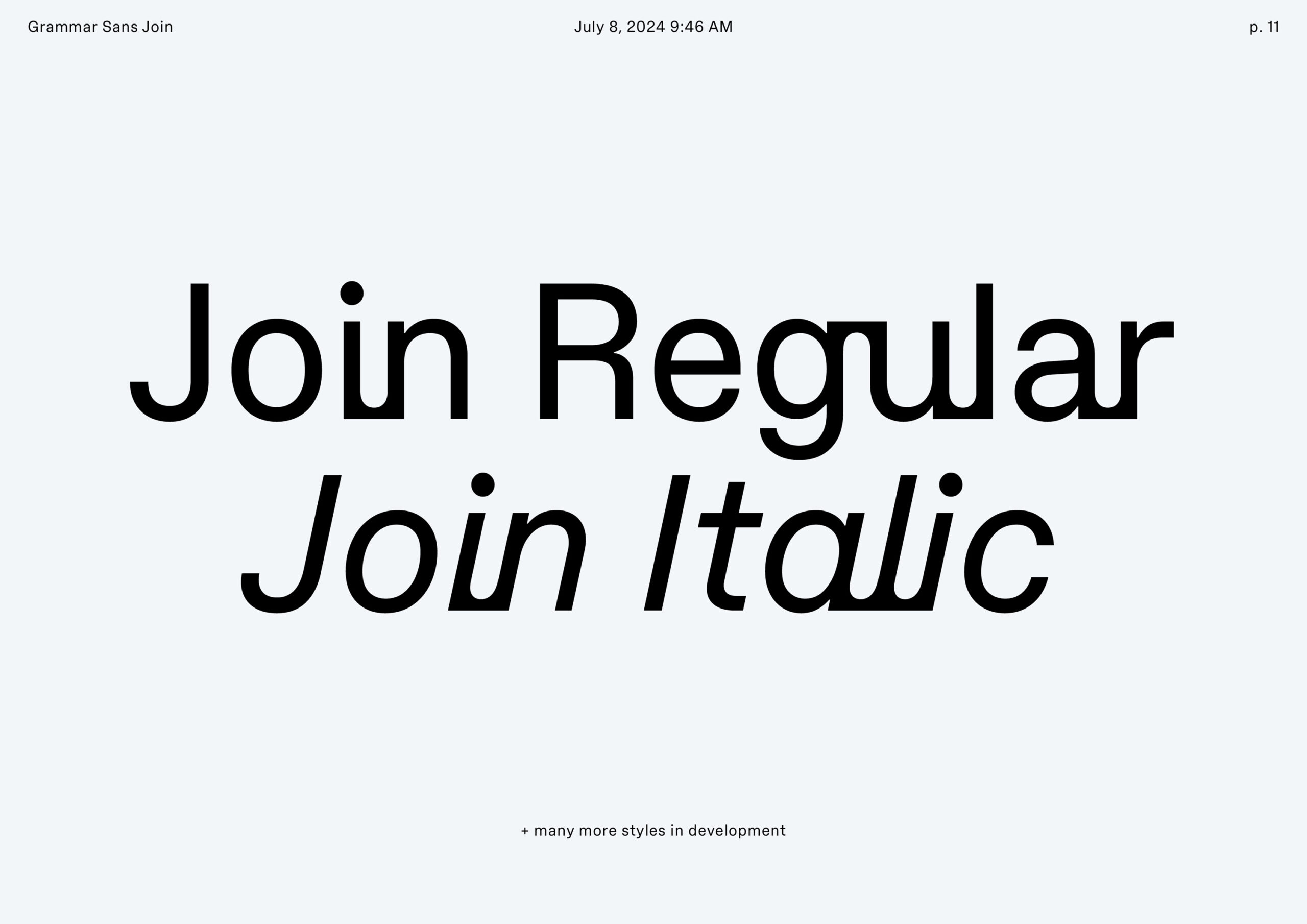
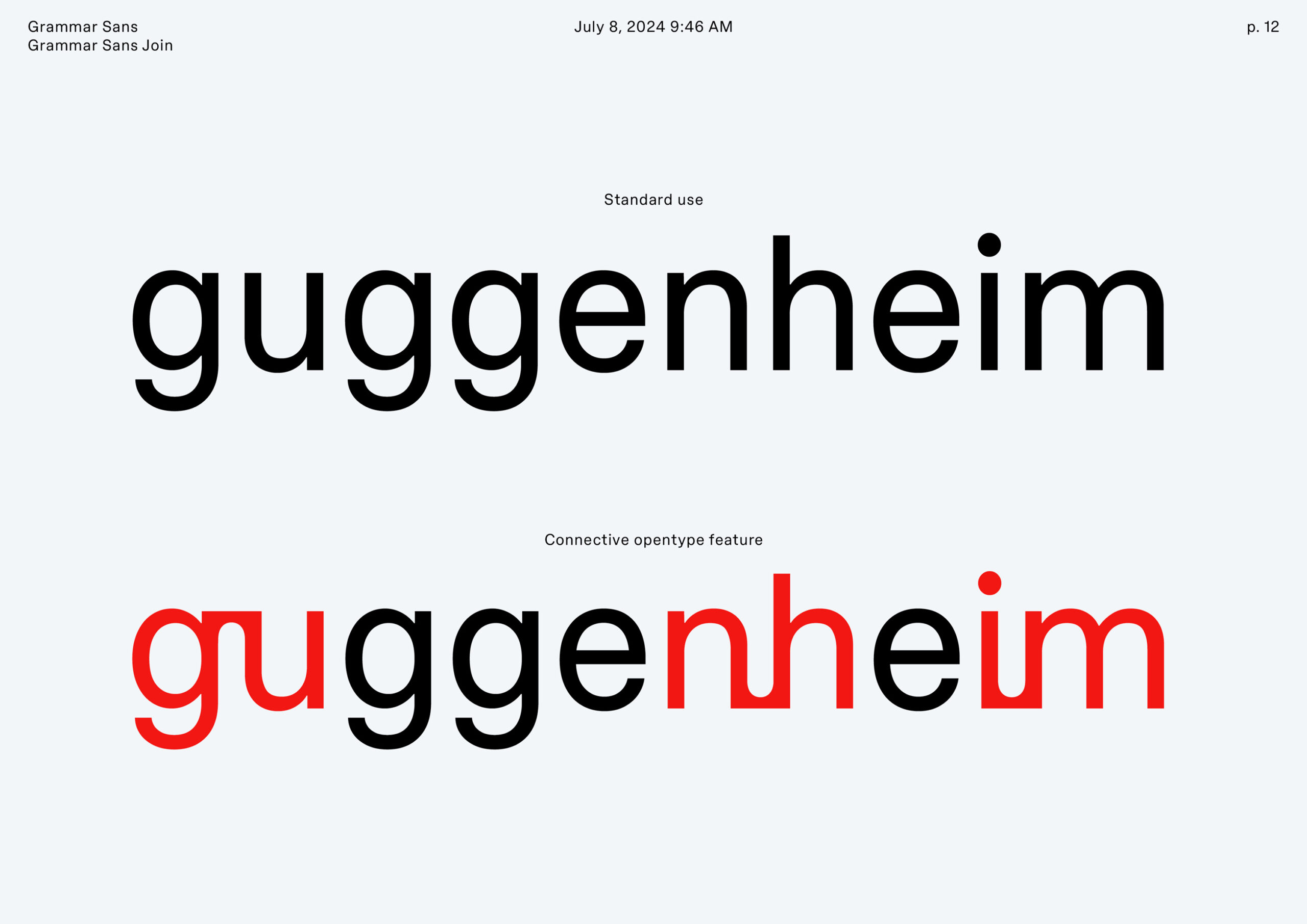
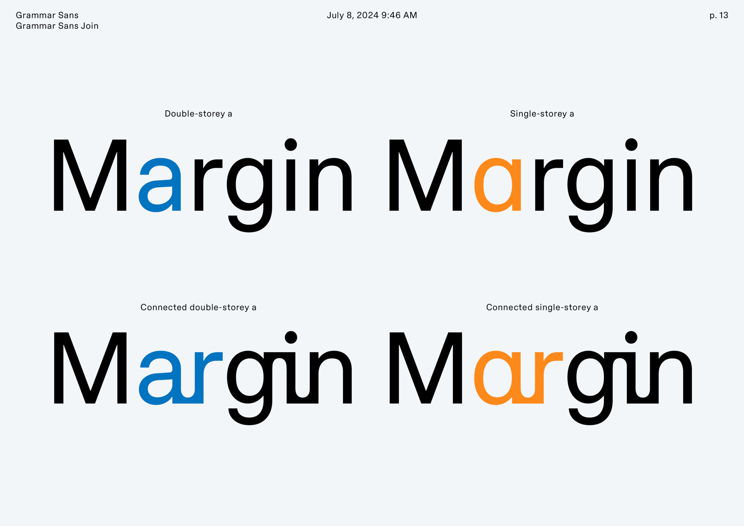
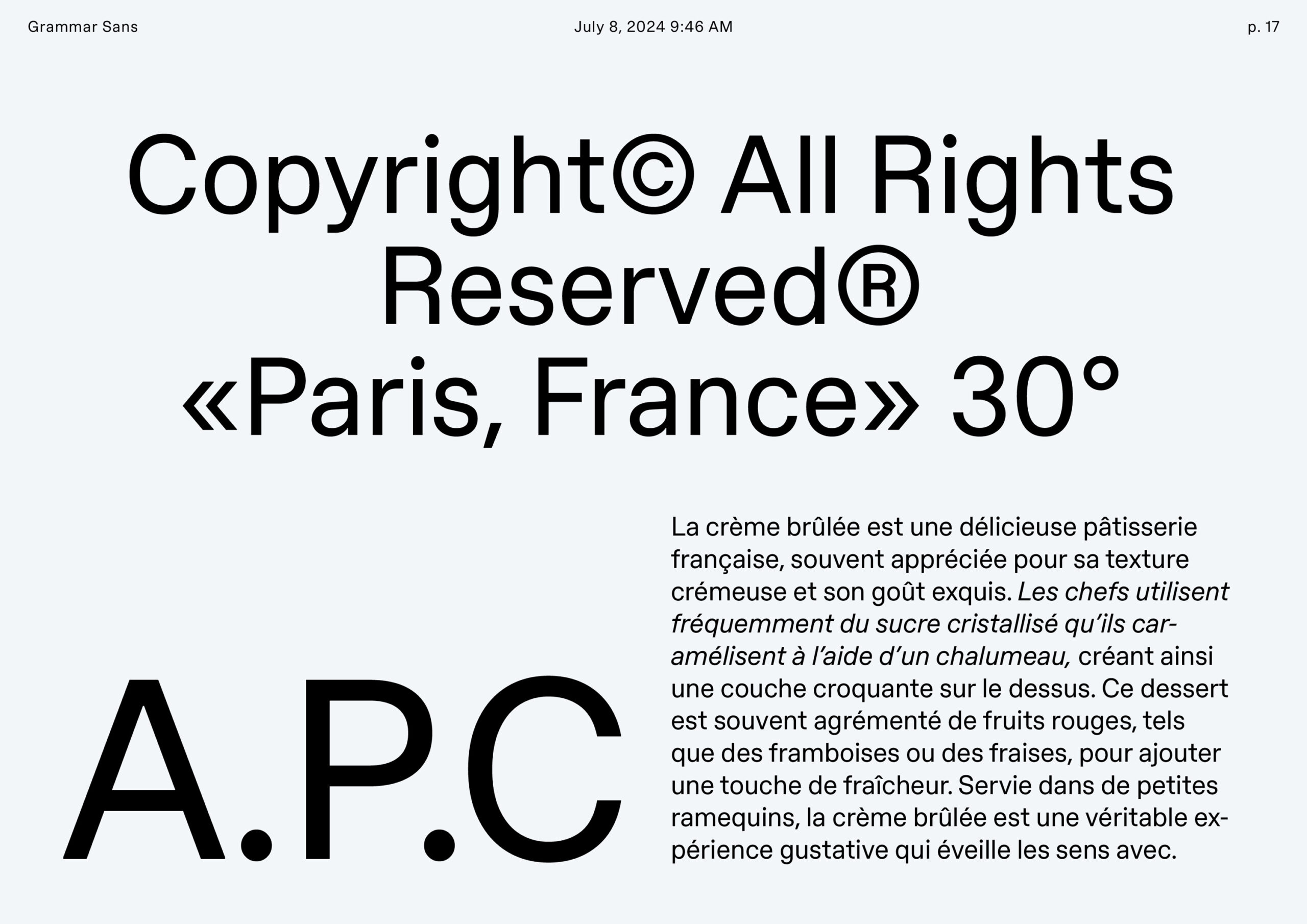
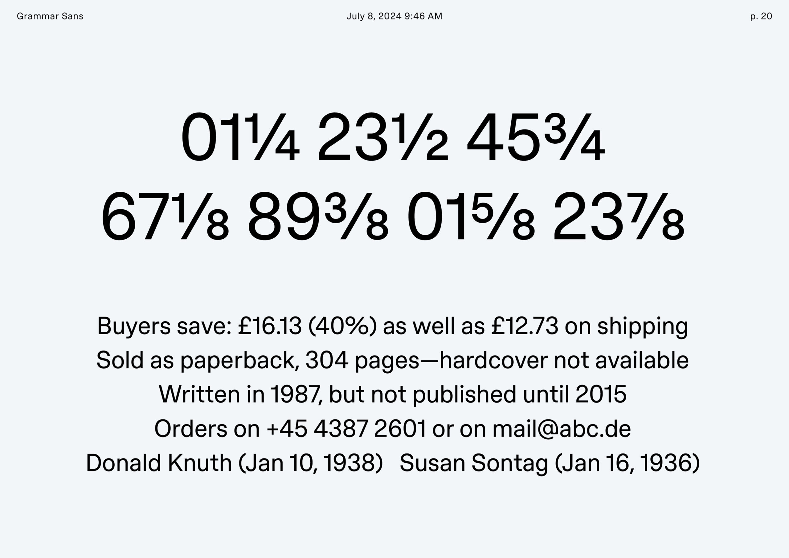
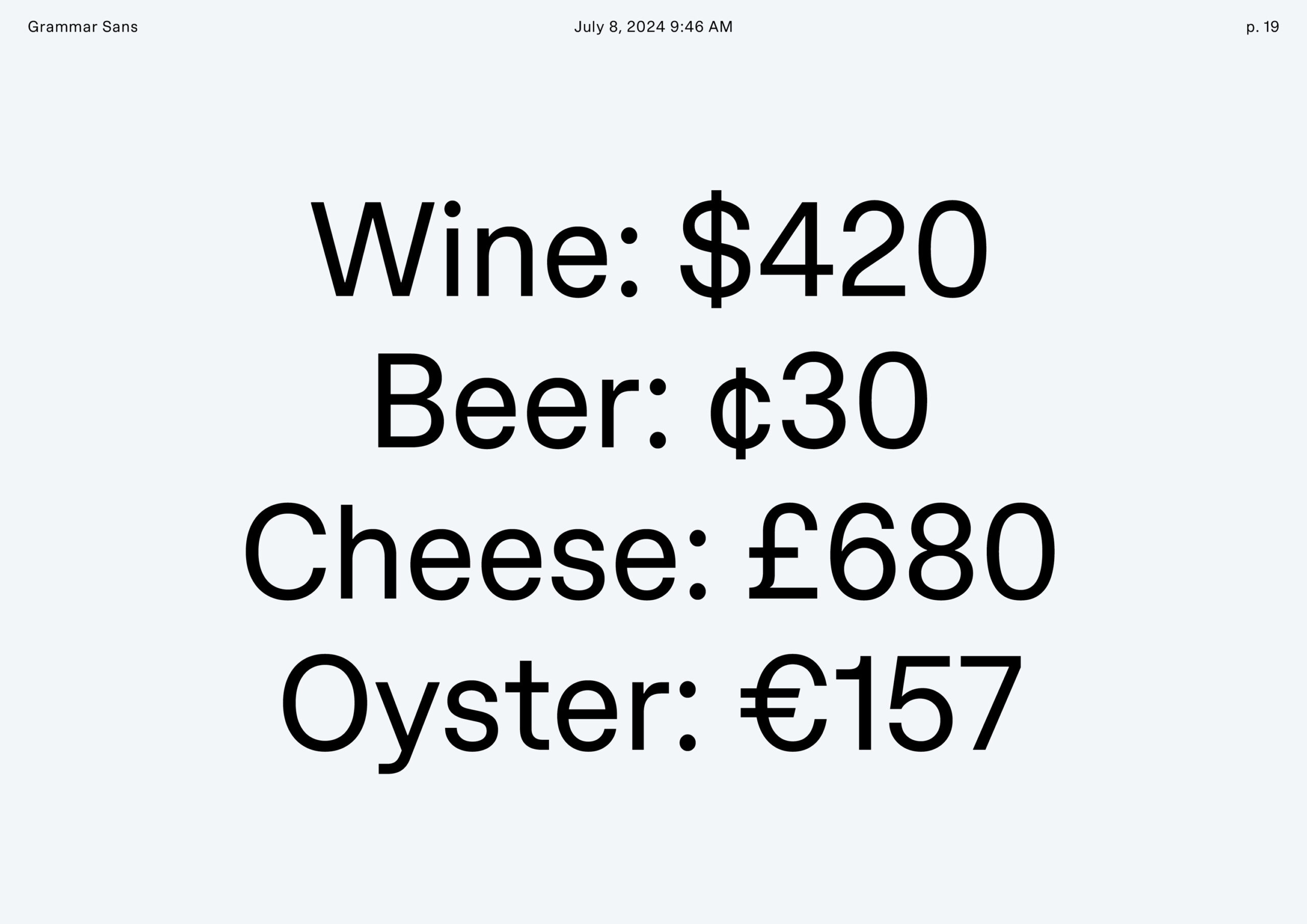
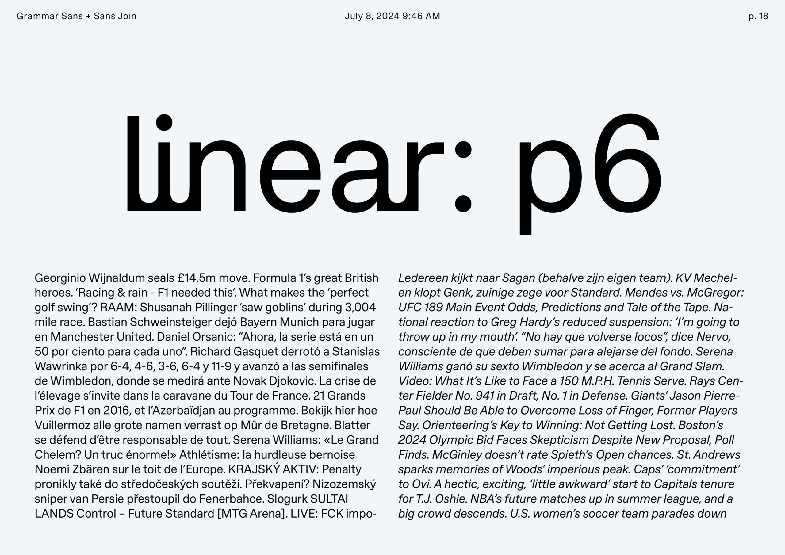
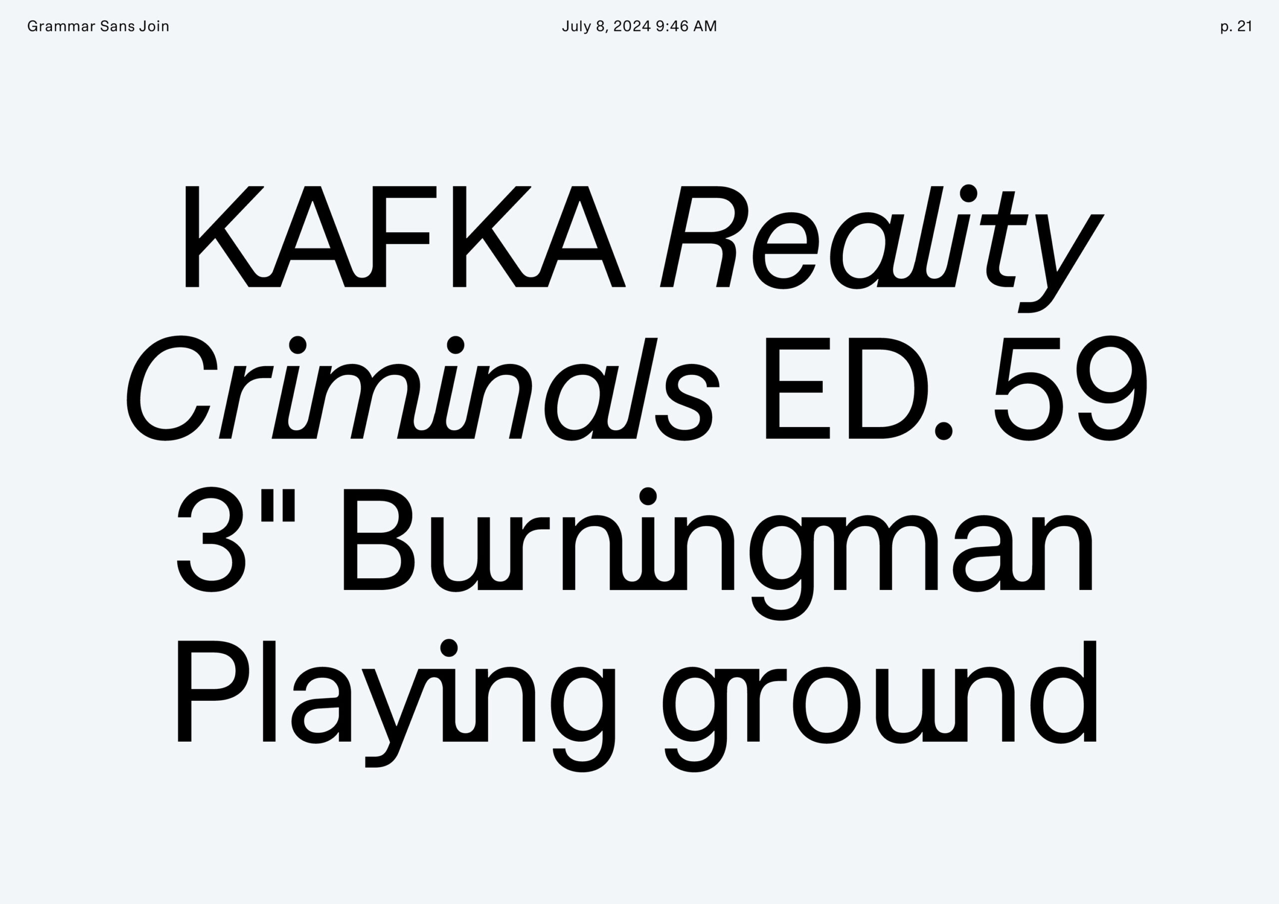
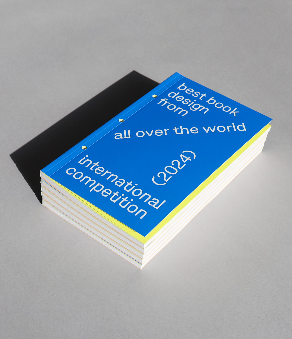
Grammar Sans and Grammar Sans Join are the first two styles of a typeface initially developed for Stiftung Buchkunst, and is currently under development as a larger retail typeface family. Grammar Sans is a functional and versatile sans serif typeface, whereas Grammar Sans Join is more experimental by way of its combining of script and sans serif genres, through an extensive and fully automatic use of contextual alternates.
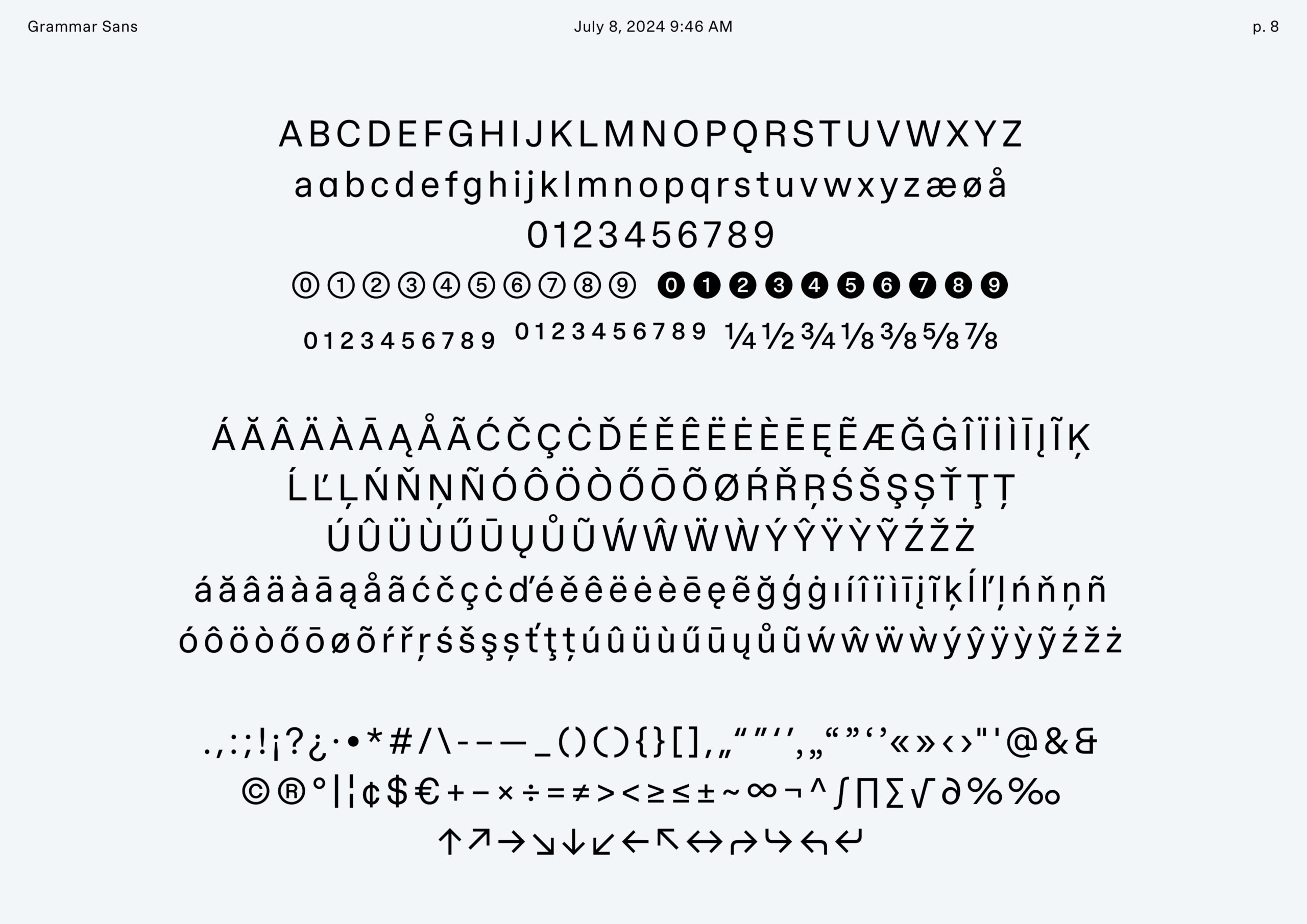
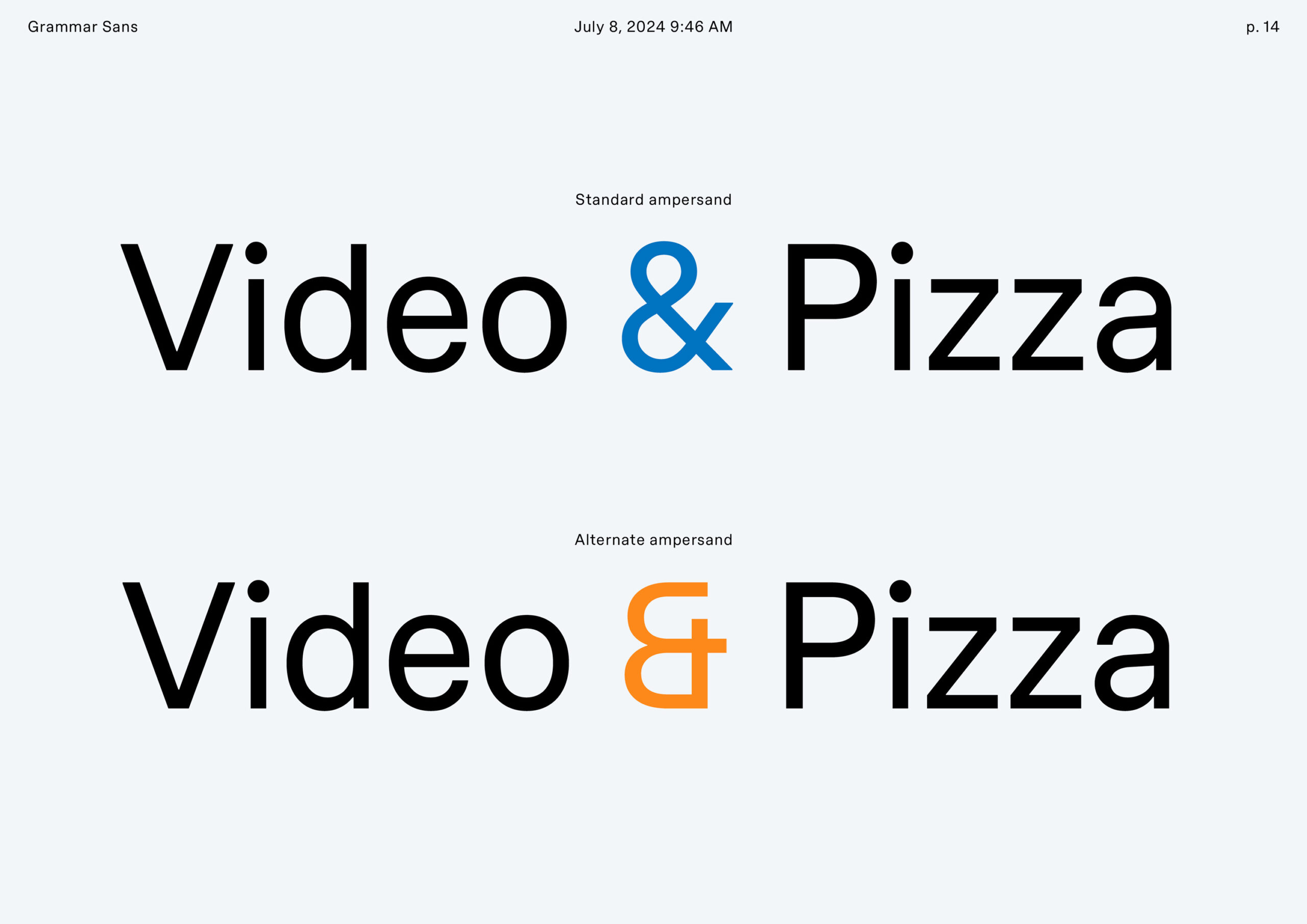
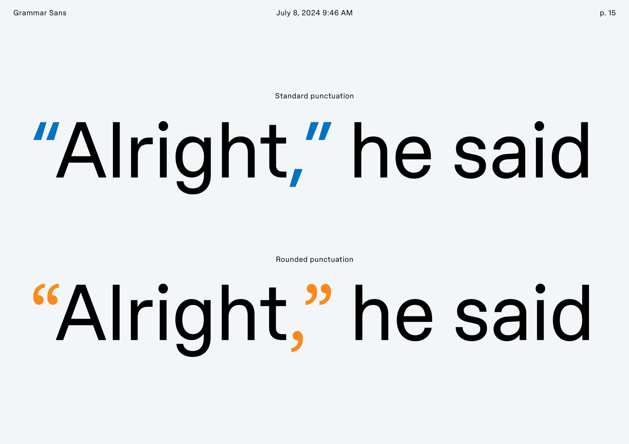
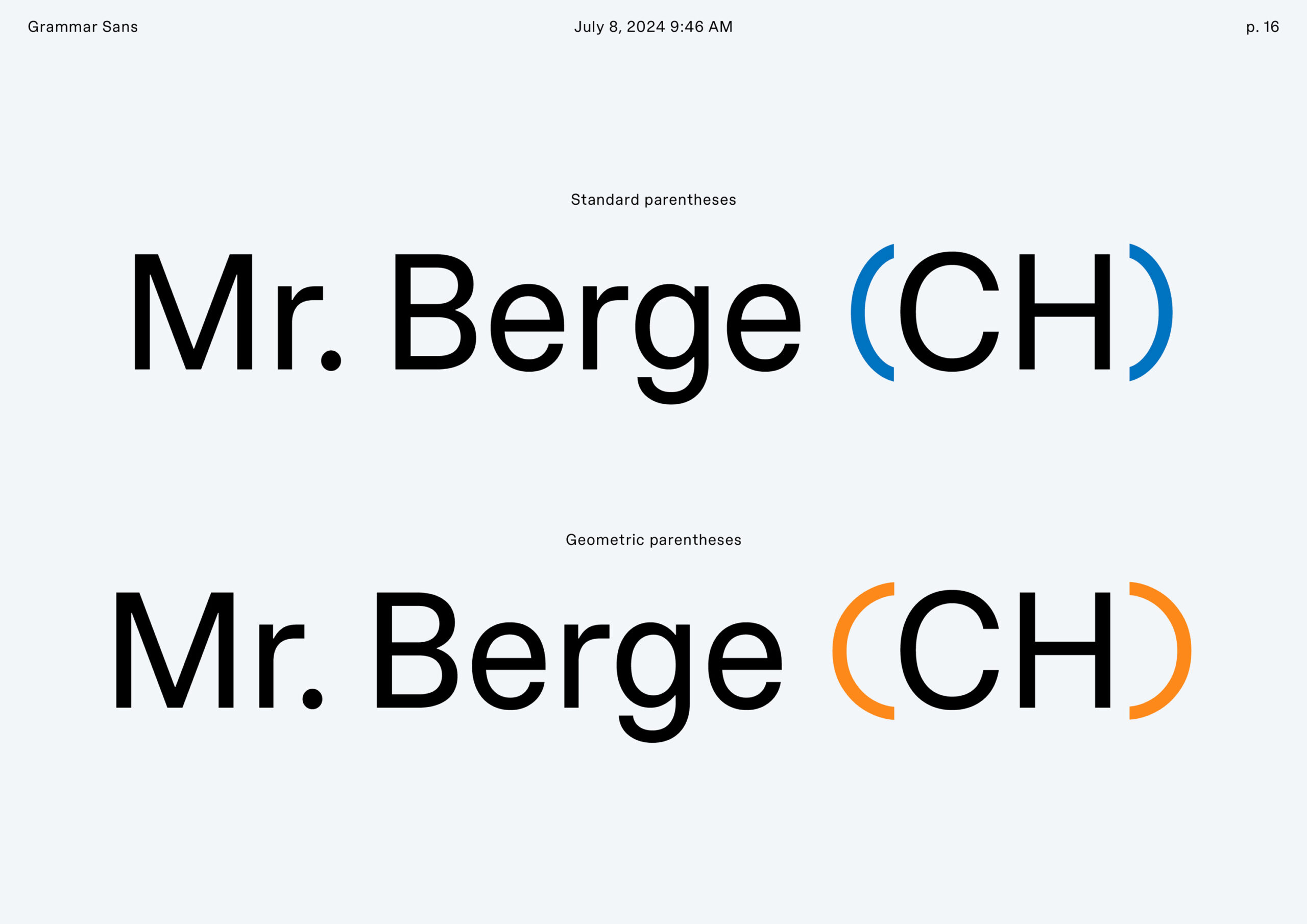
Building on ideas of neutrality, geometry and precision, the typeface is crafted into a contemporary yet timeless grotesque with slightly narrow proportions and low contrast. Its meticulously constructed basic cut features just enough warmth and subtle quirks to be well equipped as a go-to sans, that can stand the test of time while bringing character and quality to the design. This in turn creates the foundation on which the script-like aspects of the Join cut can unfurl its geometric, graphic and playful connections – functional workhorse and avant-garde expression rolled into one. Alternate character sets featuring rounded punctuation and geometric parenthesis offer further range of expression and add to the designers toolkit.
